Website Image Sizes: How to Choose the Right Dimensions
Uploading an image to a website sounds simple until it appears stretched, blurry, cropped incorrectly, or much larger than necessary.
These problems often happen because the image dimensions were chosen without considering the space where the image will appear.
A homepage banner, blog featured image, product photograph, and small thumbnail do not necessarily need the same dimensions.
This guide explains how to choose image dimensions for different website placements and how to avoid common mistakes.
What Are Website Image Dimensions?
Image dimensions describe the number of pixels across an image’s width and height.
For example, an image measuring 1600 × 900 pixels is 1600 pixels wide and 900 pixels high.
Dimensions are different from file size.
- Dimensions describe pixel width and height.
- File size describes how much storage or data the image uses.
A large-dimension image can have a relatively small file size after compression, while a smaller image can still be heavy depending on its format and content.
Common Website Image Dimensions
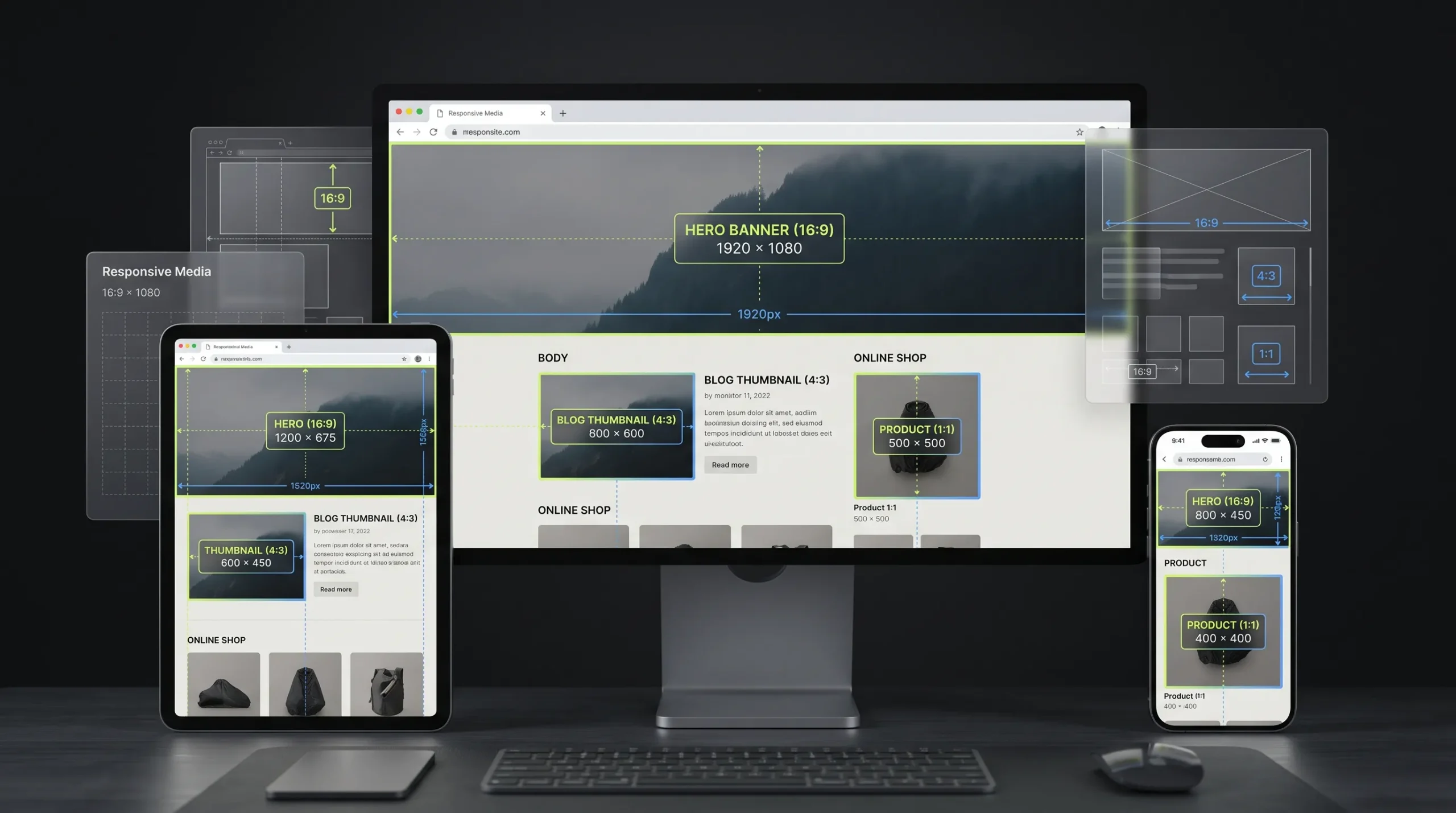
There is no universal image size that works for every website. The following are practical starting points, not fixed standards.
| Placement | Example dimensions | Aspect ratio |
|---|---|---|
| Wide hero image | 1920 × 800 | 2.4:1 |
| Blog featured image | 1200 × 675 | 16:9 |
| Square product image | 1000 × 1000 | 1:1 |
| Landscape product image | 1200 × 900 | 4:3 |
| Blog thumbnail | 600 × 400 | 3:2 |
| Social-style vertical image | 1080 × 1350 | 4:5 |
Your theme, content layout, and responsive breakpoints may require different sizes.
How to Choose the Right Image Dimensions
1. Identify Where the Image Will Appear
Start by checking the actual space available in your website layout.
A full-width hero banner needs a different composition from a small card thumbnail.
Measure the displayed area or inspect the theme’s image settings before preparing the file.
2. Consider the Largest Display Size
If an image may appear at 800 CSS pixels wide on a high-density screen, you may need a source image with more than 800 physical pixels to keep it sharp.
However, do not upload extremely large originals without a reason. Use responsive image techniques to serve suitable versions for different screen sizes.
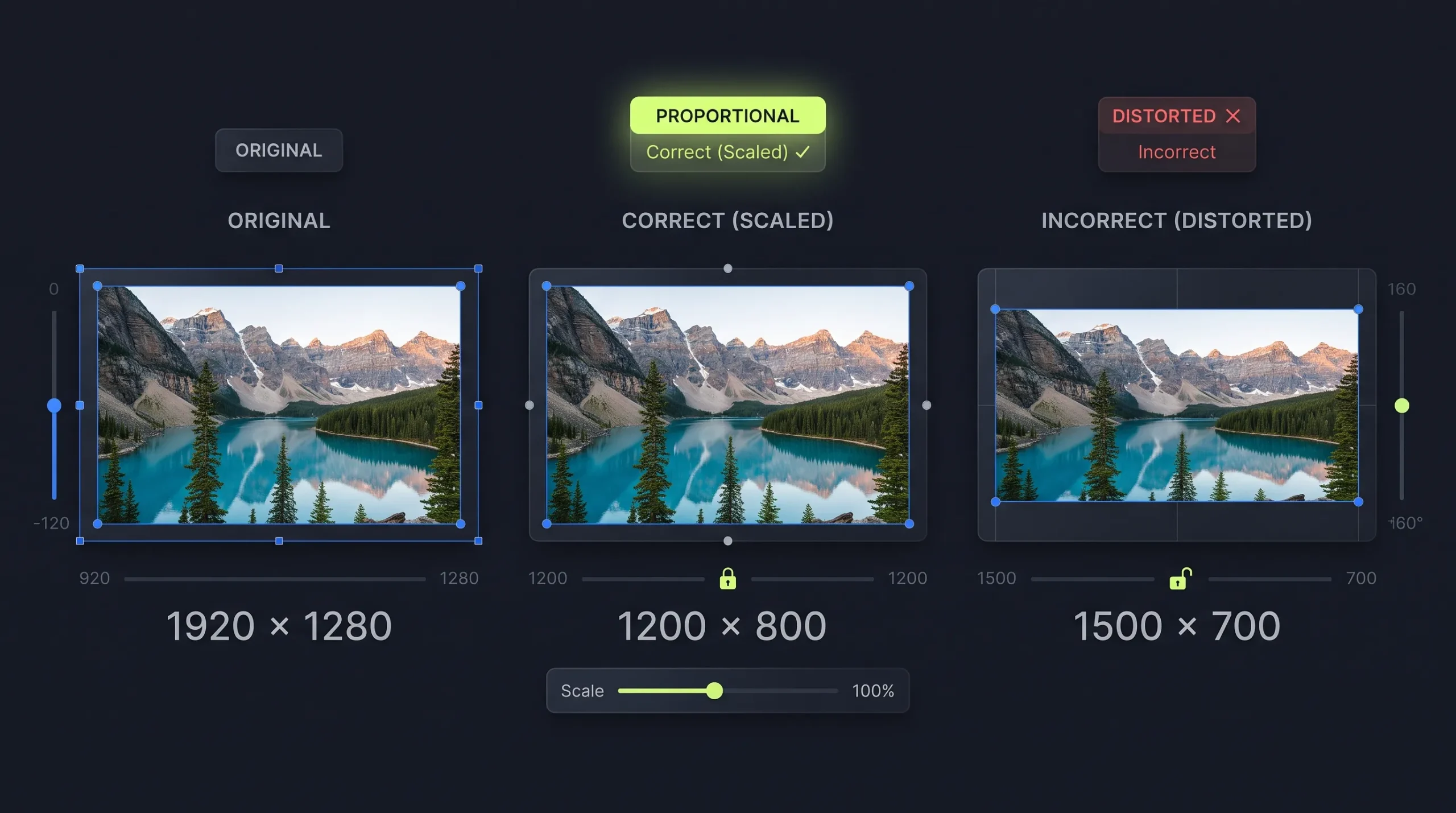
3. Preserve the Aspect Ratio
Keep the image’s proportions when resizing.
If the layout requires a different shape, crop the image deliberately instead of stretching it.
For example, a 16:9 blog image should not be forced into a square without considering which parts will be removed.
4. Prepare Mobile and Desktop Versions Where Needed
A wide desktop banner may not work well on a narrow phone screen.
Important subjects can become too small or disappear when the same image is cropped on mobile.
Use responsive image handling and art direction where the layout requires different compositions.
5. Optimize the File Size
After choosing the dimensions, select a suitable format and compression level.
For many website photographs, WebP is worth considering. Read our guide to PNG vs WebP to understand when each format is useful. Replace this placeholder with the published article URL once it is live.
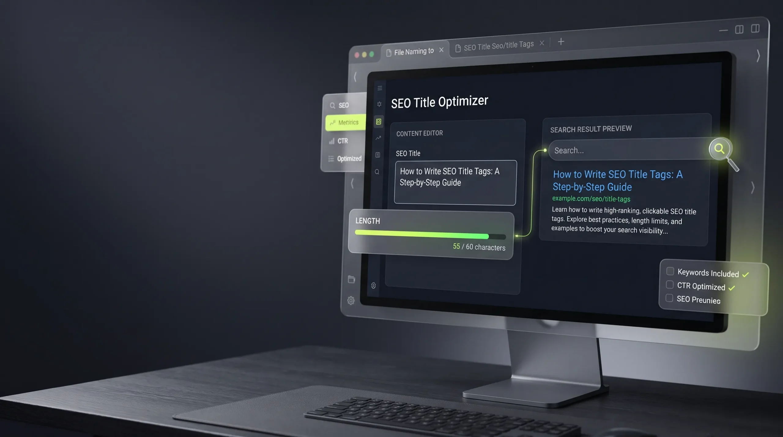
Google’s image SEO documentation recommends high-quality images, relevant placement, descriptive filenames, and useful alt text.
How to Resize an Image for Your Website
- Choose the image you want to use.
- Identify the target placement and dimensions.
- Open the Image Resizer on The Awais Ali.
- Enter the desired width and height while preserving the aspect ratio where appropriate.
- Crop only when the layout requires a different shape.
- Preview the output on desktop and mobile.
- Compress the final image if necessary.
Insert the verified canonical URL of your Image Resizer tool before publishing.
Why One Image Size Does Not Work Everywhere
A 1920-pixel-wide image may be suitable for a large banner but unnecessary for a small thumbnail.
Using the same oversized image in every location can waste bandwidth. Using one small image everywhere can make large placements appear blurry.
The solution is to prepare image versions for their actual display requirements.
HTML responsive image features such as srcset and sizes help browsers select an appropriate source for different display conditions. See the MDN responsive images guide.
Common Website Image Mistakes
- Uploading images without checking their dimensions.
- Using the same image file for every placement.
- Stretching images to fill containers.
- Ignoring mobile crops.
- Uploading oversized photographs.
- Compressing images so aggressively that details disappear.
- Forgetting meaningful alt text.
- Using a background image when a meaningful content image should be an HTML image element.
Frequently Asked Questions
What is the best image size for a website?
It depends on the placement. A hero banner, product image, blog thumbnail, and icon have different requirements. Measure the layout and prepare an image suitable for its display size.
Are larger images always better?
No. Larger images may preserve more detail, but they can also increase file size and download time. Use enough resolution for the display without uploading unnecessary data.
What size should a blog featured image be?
A 1200 × 675 pixel image is a practical 16:9 starting point for many blog layouts, but check your WordPress theme and social sharing requirements.
Should website images be square?
Only when the design calls for a square image, such as some product cards or profile layouts. Other placements may work better with landscape or portrait ratios.
Does image dimension affect SEO?
Image dimensions alone do not guarantee rankings. Proper sizing can contribute to a better user experience and performance, while relevant image content, page context, filenames, and alt text help search engines understand images.
Final Thoughts
The right website image dimensions depend on where the image will appear and how it will be displayed across devices.
Measure the layout, preserve the aspect ratio, prepare mobile-friendly versions where needed, and optimize the final file. A consistent image workflow helps your website look professional without making pages unnecessarily heavy.